
뒤로
Usage time statistics
Last updated :
The "Usage Time" graph shows your child's app usage by time of day.
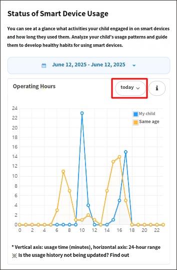
- The horizontal axis displays the 24 hours of the day, and the vertical axis represents the app usage time (in minutes).
- The blue line represents your child's usage time, while the yellow line represents the usage time of children the same age as your child, serving as data to compare your child's app usage with others.
- The points on the lines represent the time the app was closed. For example, if a point is marked at 25 minutes during the 10 AM hour on the horizontal axis, it means your child started using the app at 9:35 AM and finished around 10:00 AM.
- This graph also includes the usage time of "Always Allowed" apps. Therefore, it may appear as though your child has used the phone more than the daily limit set by parents. You can exclude this time by tapping the options button and checking "Exclude Always Allowed apps and call duration."
• Related Topics
- Can I limit smartphone usage to only 3 hours per day?
- Used after daily usage limit exceeded
- Timeline logs are not visible

